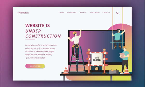
Webpage Screen Resolution Simulator by Alaikas is an online tool that lets you preview how a webpage looks across different screen sizes, including mobile, tablet, laptop, and desktop. It helps identify layout, readability, and usability issues so you can improve user experience before visitors encounter problems.
Table of Contents
Introduction
You can build a beautiful webpage and still lose users without realizing why.
On your own screen, everything looks clean and balanced. On a phone, the headline wraps awkwardly. On a tablet, the layout feels cramped. On a smaller laptop, the call to action slips out of view.
This is where the Webpage Screen Resolution Simulator by Alaikas becomes genuinely valuable. It helps you step outside your own screen and see your webpage the way real people see it, across different devices and screen sizes.
Not as a technical experiment.
As a practical, human check that protects your users’ experience.
What the Webpage Screen Resolution Simulator by Alaikas does
At its heart, a webpage screen resolution simulator lets you preview your webpage at different viewport sizes. These sizes reflect how content appears on phones, tablets, laptops, and large desktop screens.
Instead of guessing how your layout behaves, you can see it instantly.
The Alaikas simulator focuses on clarity and speed. You enter a page, choose a screen size, and view how the design responds. That simple action often reveals issues you would never notice on a single monitor.
Why screen resolution testing matters in real life
Users do not adapt to broken layouts
Visitors expect websites to feel natural on their devices. If they have to zoom, scroll sideways, or hunt for buttons, they do not adjust. They leave.
A simulator helps you catch these friction points early.
First impressions are visual before they are verbal
Before users read your content, they absorb how it feels. Clean spacing, readable text, and visible actions build trust. Cluttered or broken layouts quietly damage credibility.
Mobile experience is no longer secondary
For many sites, mobile traffic is the majority. That means the mobile view is not a smaller version of your site. It is often the main version.
Using a screen resolution simulator helps you treat mobile layouts with the attention they deserve.
Screen resolution vs viewport, explained simply
People often say “screen resolution,” but web layouts are controlled by the viewport, which is the visible area where the webpage renders inside a browser.
Toolbars, browser UI, and scaling all affect this space. That is why testing viewport sizes is more useful than relying on device specs alone.
The Alaikas simulator reflects this reality, showing how your layout behaves within different viewport widths. This gives you a more realistic picture of what users actually see.
How to use the Webpage Screen Resolution Simulator by Alaikas effectively
You do not need a complex process to get real value from this tool. A simple, focused approach works best.
Start with pages that matter
Begin with pages where experience directly affects results:
- landing pages
- service or product pages
- pricing pages
- forms and checkout flows
- high traffic blog posts
These pages benefit most from early layout checks.
Test a small but meaningful range of sizes
Instead of testing everything, focus on:
- a small mobile screen
- a modern smartphone screen
- a tablet size
- a laptop screen
- a large desktop view
This range reveals most layout issues without overwhelming you.
Look for human experience problems
As you preview each size, ask:
- Can I read this comfortably without zooming?
- Is the main message clear within a few seconds?
- Are buttons easy to tap and clearly visible?
- Does anything feel crowded or awkward?
- Does the layout stay stable as it loads?
These questions reflect how real users interact with your page.
Common issues the Alaikas simulator helps you catch
Text that feels too small or too tight
Font sizes and line spacing that work on desktop often feel strained on mobile.
Buttons that are hard to tap
Touch screens need space. Small or tightly packed buttons frustrate users quickly.
Images that crop poorly
Hero images and banners often lose their meaning at certain widths.
Layouts that break between breakpoints
Some designs look fine at common sizes but fail at in-between widths. A simulator makes these weak points visible.
Forms that feel annoying on mobile
Fields can overflow, labels can overlap, or submit buttons can slip too far down the screen.
Where the Alaikas simulator fits in your workflow
The Webpage Screen Resolution Simulator by Alaikas works best when used regularly, not just once.
Use it:
- before publishing a new page
- after design or layout changes
- when engagement drops unexpectedly
- when testing new templates or content formats
It becomes a quiet habit that prevents avoidable mistakes.
What a screen resolution simulator cannot replace
While extremely helpful, a simulator is not a full replacement for everything.
It does not fully replicate:
- real device performance
- touch gestures and scrolling behavior
- browser specific quirks
- network speed conditions
Think of it as your first layer of confidence. For critical pages, pairing it with real device testing adds extra assurance.
Conclusion: seeing your site the way users do changes everything
The Webpage Screen Resolution Simulator by Alaikas is not about chasing perfect design. It is about awareness.
It gives you the ability to step into your users’ perspective and catch problems before they create frustration. When your content reads clearly, your buttons feel easy to tap, and your layout stays calm across screens, users trust you more.
That trust turns into time, attention, and action.
And that is the real value of testing your webpage across screen resolutions, not as a technical chore, but as a simple act of respect for the people visiting your site.
FAQs About Webpage Screen Resolution Simulator by Alaikas
What is the Webpage Screen Resolution Simulator by Alaikas used for?
It is used to preview how a webpage looks at different screen sizes so you can identify responsive layout issues before users encounter them.
Is this tool only for developers and designers?
No. Content creators, marketers, business owners, and site managers all benefit from seeing how pages appear on different devices.
Does screen resolution testing improve user experience?
Yes. It helps ensure text is readable, buttons are usable, and layouts feel comfortable on all screens.
How often should I use a screen resolution simulator?
Use it whenever you publish new pages, update layouts, or notice changes in engagement that may be linked to design issues.